
[Index | Art | Poetry | Writing | Books and Authors | Help!! | About Me! | Rings | LOTR]
|
Quick Links:
1. New Image 2. Select Color 3. Layers 4. Text 5. Drop Shadow 6. Decrease Color 7. Save |
| 4. Working with Text | |
|
Select the Text tool |
|
|
|
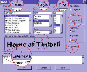
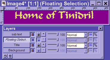
When you click "OK" your text will appear surrounded by the "marching ants" selection marquee. Also notice that it created a temporary new layer called "Floating Selection" residing just above your Title layer. Your text can be worked with on its own without affecting anything in the Title layer as long as you have it floating. Place your cursor over the selected text, it will change to a four-sided arrow. You can move your title anywhere you like by clicking and holding the mouse button down while you drag.
My example banner has simple flat text with a drop shadow. However, at this point, you could experiment with the other filters which come with PSP 5. Don't worry about ruining your banner, you can use the Undo command from the File Menu if you don't like the results. You can even undo many times back. First, let's get rid of the "marching ants" so we can see the text better (1). To do this, use "Selections/Hide Marquee"... just don't forget that your text is still selected and floating! Now use "Image/Other/Hot Wax Coating" once (2). The result will not be much more than a darkening of the color. Now use it again (3). This will give your text a 3D effect, shading the edges.
|
| 5. Adding a Drop Shadow | |
|
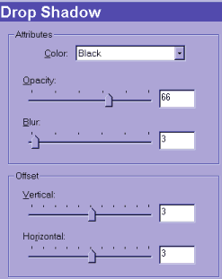
To add a drop shadow, use "Image/Effects/Drop Shadow" from the main menus. To create the kind of shadow I use for this example, use the settings at left: For Attributes, Color: black; Opacity: 66; Blur: 3. For Offset, Vertical: 3; Horizontal: 3. |
|
On the right side of the Drop Shadow dialog box is the preview window (not shown here) which shows you how your settings will look. Play with the settings to see what happens, you can always return to the ones I have here if you like, but you may find some effect you like better. Click "OK". You can now deselect the text, use "Selections/None". This will place your text, with any effects and drop shadows, onto the Title layer. |
|
| Continue by selecting the "sub text" layer from the Layer palette. Repeat step 4, but this time choose a different color, font, size, etc... and don't use a drop shadow. You can use this line to add your URL, or other text which explains the content of your site. In my example, I used white text. It is important to choose colors which contrast in value (lightness/darkness) with the background color. | |
| 6. Decrease Colors | |
|
Once you have your lines of text placed where you want them, but before we do any color reduction, it is time to save the working file before going on any further. Use "File/Save As". I like to save my "working" files in the PSP folder "Images". This might even be the default folder to which the "Save As" command will take you. But you can save your .psp file wherever you like.
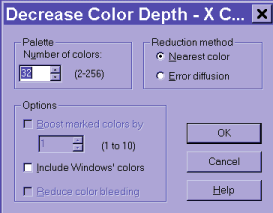
To reduce the colors, and hence the file size of your banner, start by using "Colors/Decrease Color Depth/X Colors (4/8 bit)". This will cause a caution box to pop up which reads: This function can only be performed on an image with a single layer. The current image has multiple layers which must be merged before the function can be applied. Would you like to merge the layers and proceed with this process?Click "Yes" |
|
|
The Decrease Color Depth window gives you the option of choosing exactly the number of colors you wish to use. I have found that 32 colors usually keeps the quality of my original banner while saving at 8KB or less (often less, the example banner is just 5.17KB). |
| The settings I prefer to use here are: for Palette, Number of Colors: 32; and for Reduction Method, select Nearest Color. Do not select anything from Options. Click OK. If for some reason the result is not pleasing, you can use "Edit/Undo" to go back and try again with more colors. Or, if you save and discover that your file is over 8 KB, you can use "File/Revert" to go back to the last saved version of your working file and try again with fewer colors. | |
| 7. Save | |
|
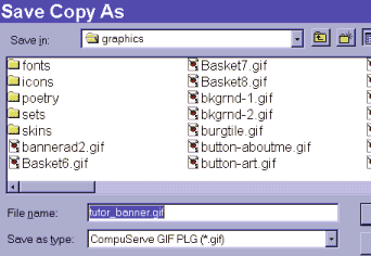
The final step is to save as a .gif file. Use "File/Save Copy As". Make sure you have "Compuserve GIF PLG (*.gif)" selected from the Save as type pull-down menu. The File name should automatically be the same as your working file, but with a .gif extention. Choose the drive and folder you want to save to from the Save in drop-down menu. |
| When you click "OK" you will get one more dialog box for Row Order. Choose Normal for a banner which will begin loading from the top and scroll down as it loads. Choose Interlaced for a banner which will start out with large, blurry blocks of color and gradually come into focus. | |
|
And also:
This page last updated: October 20, 2002 |
|
